
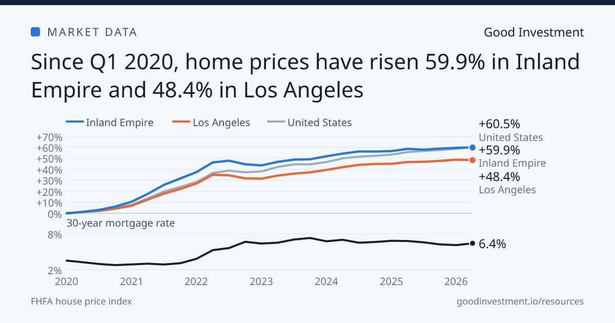
Since Q1 2020, home prices have risen 59.9% in the Inland Empire metro and 48.4% in the Los Angeles metro. The US rose 60.5% over the same quarters, so Inland Empire has nearly kept pace with the US (−0.6 points) and Los Angeles trails the US by 12.1 points.
Measured against each other, Inland Empire is 11.5 points ahead of Los Angeles since Q1 2020. Over the four quarters to Q2 2026, home prices rose 0.8% in Inland Empire and 1.2% in Los Angeles, against +3.0% for the US.
Home prices and the 30-year mortgage rate
The average 30-year fixed mortgage rate was 3.5% in Q1 2020. It fell to 2.8% in Q4 2020 and stayed at or below its starting level through Q4 2021, then climbed to 7.3% in Q4 2023. It averaged 6.4% in Q2 2026.
From Q1 2020 to Q4 2021, while rates stayed low, home prices rose 17.0% a year in Inland Empire and 12.1% in Los Angeles. From Q4 2021 to Q2 2026, as rates climbed, they rose 4.4% a year in Inland Empire and 4.4% in Los Angeles. Both slowed after Q4 2021, Inland Empire by 12.6 points a year and Los Angeles by 7.7 points. The US went from 13.1% a year to 5.9%.
| Q1 2020 to Q4 2021Rate 3.5% to 3.1% | +17.0% | +12.1% | +13.1% |
|---|---|---|---|
| Q4 2021 to Q2 2026Rate 3.1% to 6.4% | +4.4% | +4.4% | +5.9% |
| Four quarters to Q2 2026Rate 6.8% to 6.4% | +0.8% | +1.2% | +3.0% |
Compare any market
The explorer opens on Inland Empire and Los Angeles. Search for any state, metro area, county or ZIP code to draw the same comparison, with the mortgage rate underneath. For New York against Washington and every state, metro, county and ZIP code against the US, read DC and New York since the pandemic.
Using this chart
Reporters and editors may republish the chart and the figures on this page with credit to Good Investment and a link to this page. Download the chart as an image.
How the numbers are built
Home prices come from the Federal Housing Finance Agency's all-transactions house price index, which tracks repeat sales and refinance appraisals on the same homes through mortgages bought or guaranteed by Fannie Mae and Freddie Mac. Because it follows the same homes, it measures price change on a steady basket, where a median sale price moves with the mix of homes that sold. FHFA splits the largest metro areas into smaller metro divisions, and where it does, this page uses the division that holds the city. The Inland Empire line is FHFA's Riverside-San Bernardino-Ontario, CA metro area and the Los Angeles line its Los Angeles-Long Beach-Glendale, CA metro division. Figures are quarterly, nominal and not seasonally adjusted.
The mortgage rate is Freddie Mac's Primary Mortgage Market Survey average for a 30-year fixed-rate loan, a weekly series averaged over each quarter. Yearly paces are compound rates over each period. Data as of September 28, 2026.